
After a grueling 7 days of poker, 10 players made the final table in The World Series of Poker on their quest for the $10 million first prize. Explore how they got there and their final result.
Did you know that our own Brainiac, Kim Unger, is an avid poker player? She started playing with friends when she was in graduate school and never looked back. She even met her husband while playing poker!
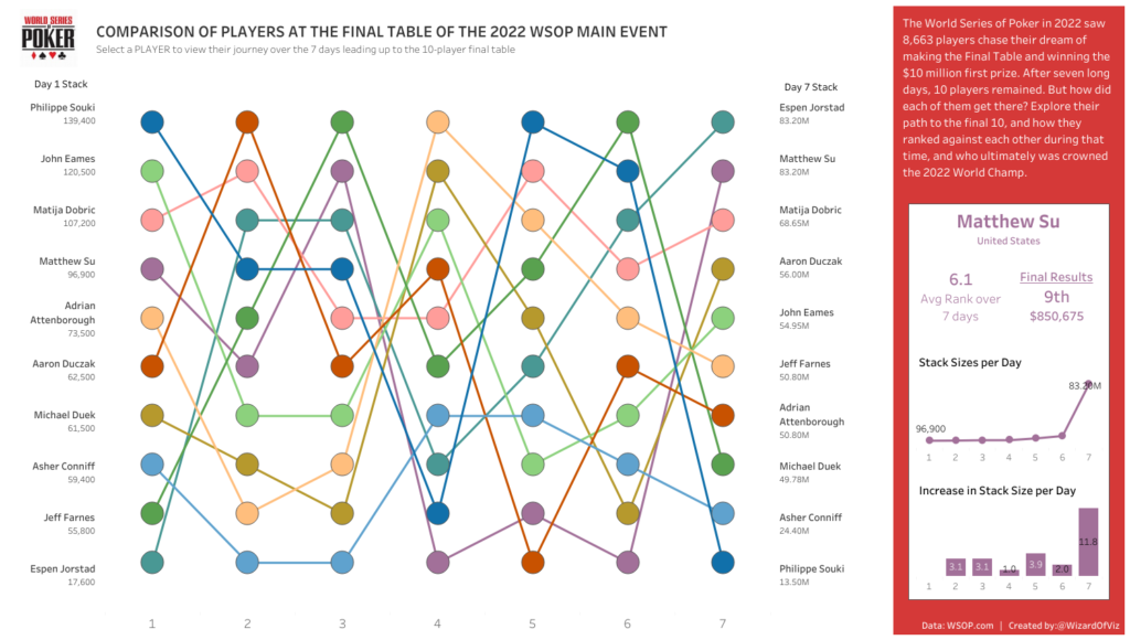
Every year, thousands of poker players descend upon Las Vegas for a chance at winning a World Series of Poker bracelet. This past summer there were eighty-nine bracelet events up for grabs. The most prestigious of them all is the “Main Event”. 8,663 people paid $10,000 for a chance to be named World Champion.
Written By:

Kim Unger
Director of Tableau Development
For the first time in 6 years, Kim and her husband skipped attending the series. But that does not mean they were not following along at home. Kim created a dashboard that allows people to track how each player at the final table progressed through the tournament. When all was said and done, Espen Jorstad prevailed and took home the $10 million first prize. Interestingly enough, Espen was almost knocked out on the first day. He battled from the lowest chip stack of all final table players, until he set himself up on Day 7 tied for the chip lead. He would ultimately use that chip lead, some amazing play, and a little luck to come home victorious.
For those not familiar with tournament poker, each player starts with 60,000 tournament chips. If you lose your chips, you are out. The last nine players (or ten in this rare case) are considered the final table. The ultimate winner is the person with all the chips at the end of the tournament. The dashboard tracks each final table player’s rank against the others throughout each of the 7 days leading to final table play.
How to use the Dashboard
Selecting a player’s name highlights their path and shows some key statistics on their tournament run on the right of the dashboard. The path is displayed with a ranked bump chart. These are a great visualization to display changes in ranks over time. The players are listed first on the left in the order of their stack sizes on Day 1. As you move through the bump chart, you can see their relative rank against the other players change. Each player’s journey to the final table was unique. The eventual champion, Espen Jorstad, started ranked on Day 1 but over time gradually found his way to the top. Conversely, Phillip Souki ended Day 1 with the most chips of all final table players but was 10th going into the last day.
How to Create the Bump Chart Viz
The ranked bump chart is made up of three visualizations: A text table of the players on Day 1 sorted from highest to lowest stack, a text table of the players on Day 7 sorted by stack size, and the bump chart. To create a bump chart, stack size was plotted by day as both a line and a dot chart and converted into a dual axis to overlay them on the same graph. A parameter to select the player of interest was used in conjunction with a parameter action to allow users to interact with the bump chart to change the details on the right-hand side of the dashboard. Selecting a player also highlights their path via a highlight action. When a player’s path is selected, their respective rank for each day is displayed.
Check out the Interactive Viz here!
Want to Build Awesome Dashboards like this?
Up-level your visualizations with our FREE Tableau style guide! Just interested in learning more from our Tableau experts? Reach out to us here!